Roman numerals tattoo guide
A Roman numeral tattoo is permanent, so the spelling has to be right before the needle touches skin. This guide covers the correct forms, the popular date layouts, and the mistakes that show up in cover-up chairs.
Written and checked by Jamey Weber, who maintains Numerus at FusionStudios. Last reviewed 5 August 2026. Every numeral on this page is produced by the same conversion logic the converter uses, which is covered by an automated test over all 3,999 values. See how we check this.
This is a spelling and conversion aid, not a substitute for checking the stencil with your artist before the first line goes in. Read the numeral back to yourself from the stencil, not from your phone.
Step one: get the numeral right
Every number from 1 to 3999 has exactly one correct Roman spelling. Type your number below and copy the result; the conversion runs in your browser and follows the standard subtractive rules, so what you copy is what an engraver or tattoo artist should ink.
2025 is written MMXXV in Roman numerals.
How to write a date for a tattoo
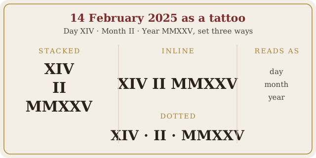
A date is three separate numbers. Convert the day, the month and the year on their own, then choose an arrangement. Take 14 February 2025: the day is XIV, the month is II, and the year is MMXXV. The three classic layouts are:
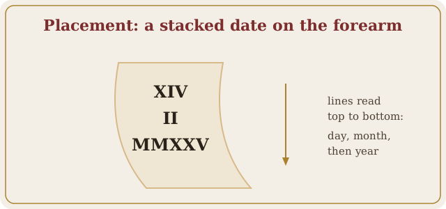
- Stacked: three lines with the day on top. The vertical format worn along a forearm, ribcage or spine.
- Inline: one line, XIV II MMXXV, often with small spaces or thin separators. Easy to read at a glance.
- Dotted: XIV · II · MMXXV, with raised dots between the parts, echoing how Romans marked divisions in inscriptions.
Year-only pieces are just as common: a birth year, a wedding year or a memorial year in a single numeral. Browse the year pages to copy any modern year, or see the full 1900 to 2099 chart.
Worked examples
Four real dates, converted part by part, so you can see how the pieces land before you commit to your own.
| Date | Day | Month | Year | Written inline |
|---|---|---|---|---|
| 14 February 2025 | XIV | II | MMXXV | XIV · II · MMXXV |
| 25 December 1990 | XXV | XII | MCMXC | XXV · XII · MCMXC |
| 1 January 2000 | I | I | MM | I · I · MM |
| 4 July 1976 | IV | VII | MCMLXXVI | IV · VII · MCMLXXVI |
Notice what the last two rows do to the shape of the piece. A single-digit day and month (I and I) next to a four-letter year is a narrow top and a wide bottom; a date like 25 December 1990 is almost the same width on every line. Neither is wrong, but the balance is worth seeing before the stencil is cut, not after.
The mistakes that end up as cover-ups
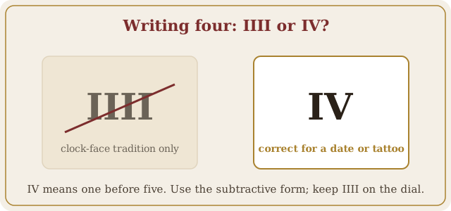
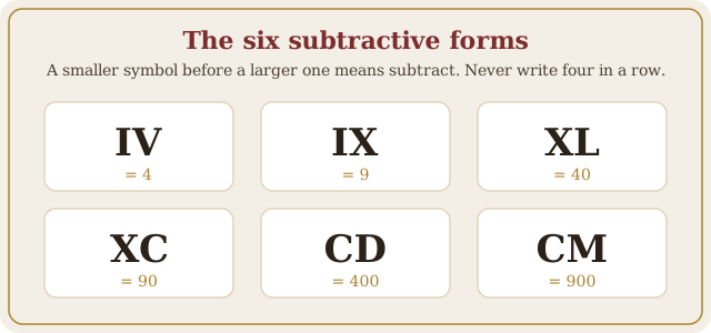
- Wrong subtractive form. Four is IV, nine is IX, forty is XL, ninety is XC. Writing IIII, VIIII or XXXX reads as an error in a date.
- Illegal subtraction. Only I, X and C can be subtracted, and only from the next one or two steps up. 99 is XCIX, never IC; 1999 is MCMXCIX, never MIM.
- Day and month swapped. II XIV MMXXV and XIV II MMXXV are different dates. Decide on day-month-year or month-day-year before the stencil is made, and tell your artist which one you chose.
- Trusting a font preview. Some decorative fonts render numerals with ligatures or swapped glyphs. Verify the plain letters first, then apply the style.
- Copying a numeral off a clock face. Watch dials are the one place IIII is traditional rather than wrong. If you take your four from a clock, you inherit a convention that does not belong on a date.
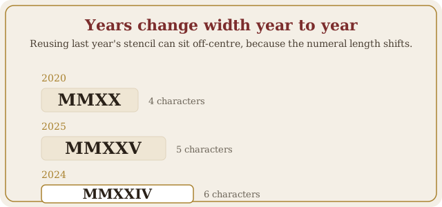
- Reusing last year's stencil. Years do not change length evenly. MMXXIV is six characters and MMXXV is five, so a design laid out for one year can sit visibly off-centre when the year changes.
Lettering: what survives, and what does not
Roman numerals are an unusual thing to letter, because almost every glyph is a straight vertical stroke. That is what makes them age well, and also what makes the wrong typeface a real risk rather than a matter of taste.
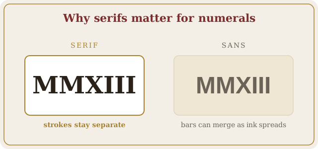
- Serifs are functional here, not decorative. The small cross-strokes at the ends of an I are what stop a run like III reading as a smudge or a bar once the ink has spread. A serif face buys you legibility that a clean sans does not.
- Script and blackletter change the letters. Decorative faces join strokes and add flourishes. In ordinary words your eye repairs that automatically; in a numeral there is no word to repair it against, so a joined VI can genuinely read as a different value.
- Check the numeral in plain letters first. Settle the spelling in a neutral face, confirm it converts back correctly, and only then hand it to a decorative treatment. Style last, spelling first.
- Watch the repeated glyphs. MM, XX and III are where letters merge first. Ask for the spacing to be set on those pairs specifically, since they decide whether the piece is still readable in ten years.
Placement and sizing notes
Roman numerals are all straight strokes, which is why they age well as tattoos. A few practical points artists repeat: fine single-needle lines blur faster than slightly bolder strokes, so very small numerals lose definition over the years. Leave breathing room between letters, especially between repeated glyphs like MM and III, or they can merge as the ink settles. For stacked dates, ask your artist to align the lines optically rather than mathematically, since MMXXV is much wider than XIV.
Check it twice, then check it backwards
Do the check here rather than promising yourself you will do it later. Three steps, one minute, and it is the last cheap moment in the whole process.
- Type the number in on the left and read the numeral it gives you. That is the spelling a standard reading produces.
- Now clear the right-hand box and type the numeral from your design into it. If the number that comes back is not the one you started with, the design is wrong, whatever the font preview looked like.
- Bring the printed numeral to the appointment, not a handwritten note and not a screen. Read it off the stencil once more before the first line goes in.
2025 is written MMXXV in Roman numerals.
Frequently asked questions
How do I write a date as a Roman numerals tattoo?
Convert the day, month and year separately, then arrange them. 14 February 2025 becomes XIV, II and MMXXV, usually stacked in three lines or written inline with dots between the parts.
How can I check my Roman numeral tattoo is correct?
Type the numeral into the converter on this page. If it reads back as the number you meant, the spelling is standard. Also paste it into the converter in reverse: type the number and confirm the numeral matches your design exactly.
Is IIII or IV correct for a tattoo?
IV is the standard form for four. IIII appears on clock faces as a long-standing tradition, but a tattoo is not a clock face: in a date, IIII reads as a mistake. Stick to the subtractive forms: IV, IX, XL, XC, CD and CM.
Do Roman numeral tattoos read top to bottom?
A stacked date reads top to bottom, one part per line: day, then month, then year. Within each line the numeral itself always reads left to right, even when the lines are stacked vertically.
What font is best for a Roman numeral tattoo?
A serif face with real serifs on the stroke ends. Roman numerals are almost all straight lines, and without serifs an I, an L and a bare stroke start to look alike as the ink spreads. Avoid decorative and script faces, which add ligatures and swashes that change what the letters say.
How small can a Roman numeral tattoo be?
Small enough is a question about strokes, not about length. Numerals are parallel vertical lines, so the risk is neighbouring strokes merging as ink settles. A long numeral like MMXXIII at wrist size crowds far sooner than a short one like MMXX, which is why identical dates in different years need different sizing.